Topper is a fiat on-ramp with higher approval rates and support for twice as many digital assets as its competitors. It is a Web3 payment tool that helps crypto projects process more customer payments through integration. The Topper payment widget is built to simplify the payment process, accept more currencies and deliver higher approval rates, resulting in fewer declines and more revenue. Developed by Uphold, the Web3 financial platform.
To preserve brand consistency, please do not alter, distort, or recreate the Topper logo outside the parameters defined in these guidelines.
We also, however, use the symbol independently of the wordmark and when deemed more impactful in a given use case. When using the symbol in isolation, it's necessary to ensure that the Uphold brand name has been sufficiently referenced so as to avoid any confusion.

Light background

Dark background
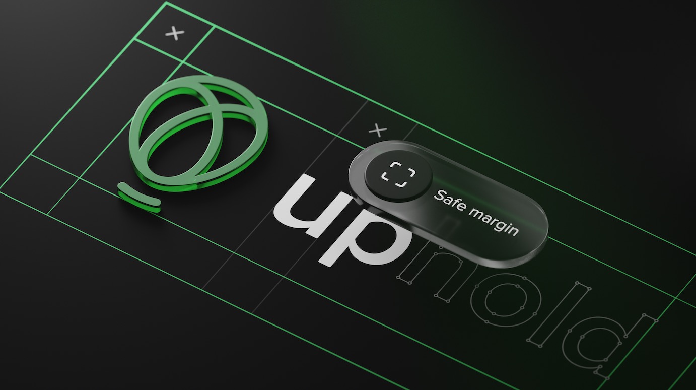
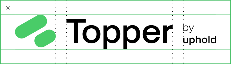
One clear spaces have been developed that shifts in size depending on the size of the mark. Everything starts with the logo.

Safe margin
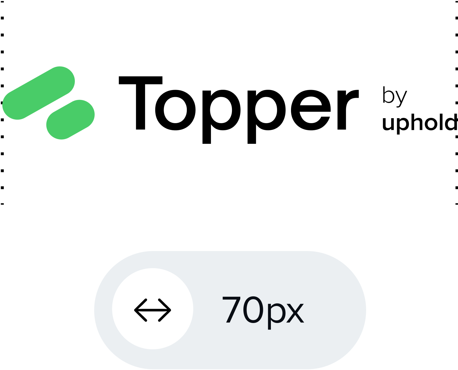
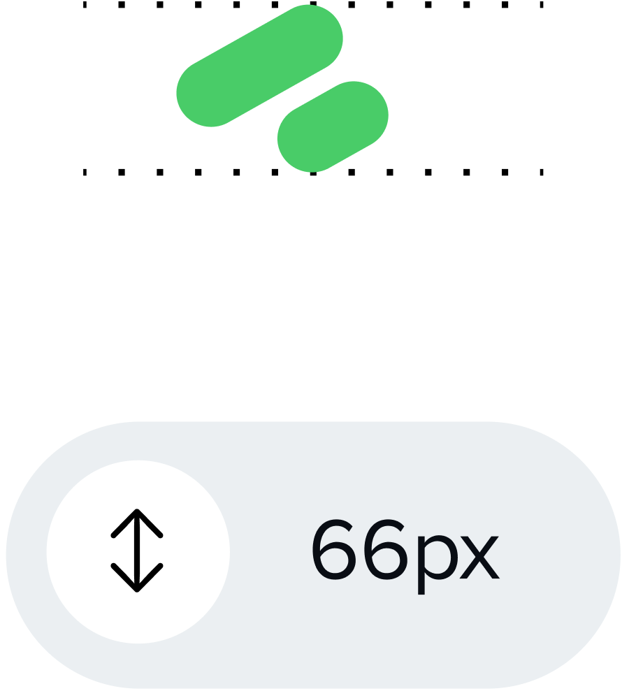
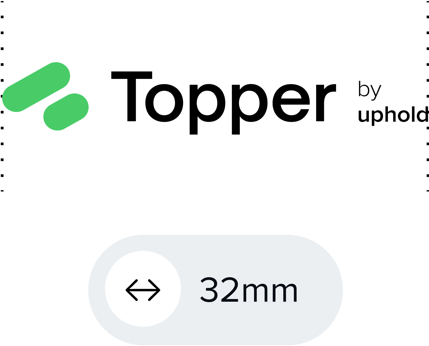
While you can scale the logo as much as you'd like, it should never go below the minimum size requirements stipulated hereunder.

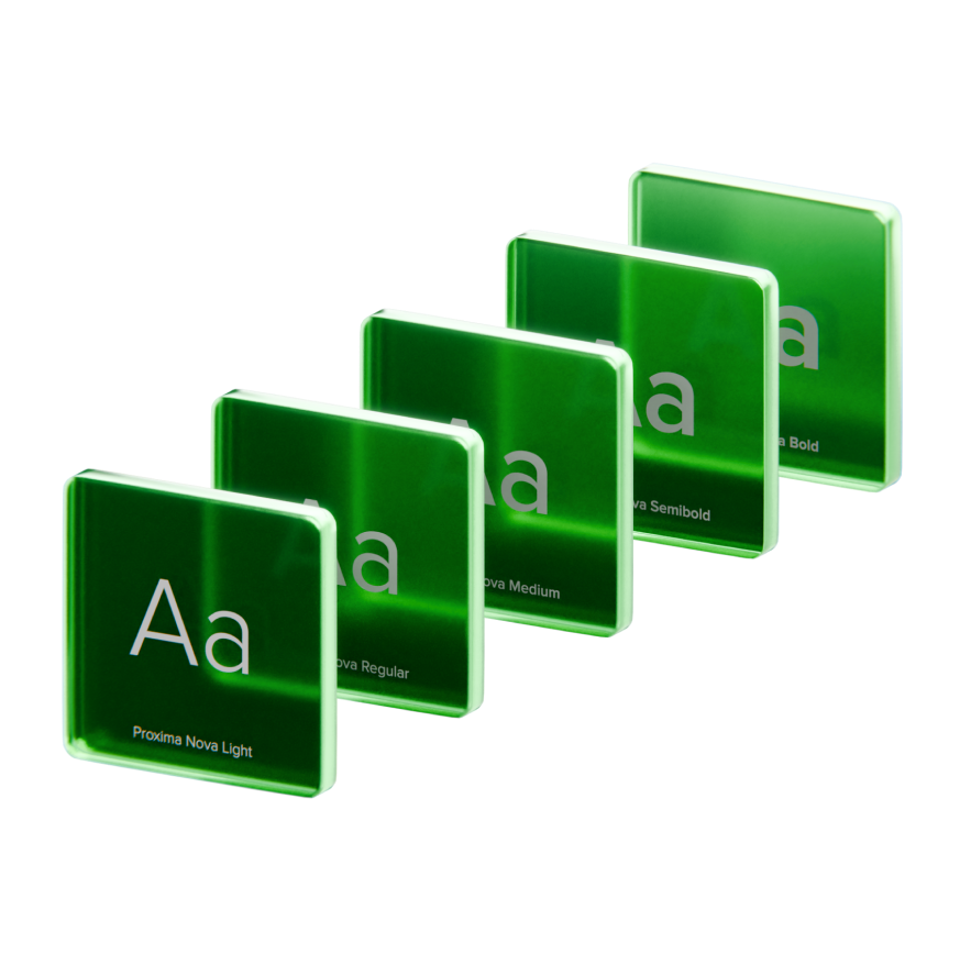

Although different applications require different typographical structures.
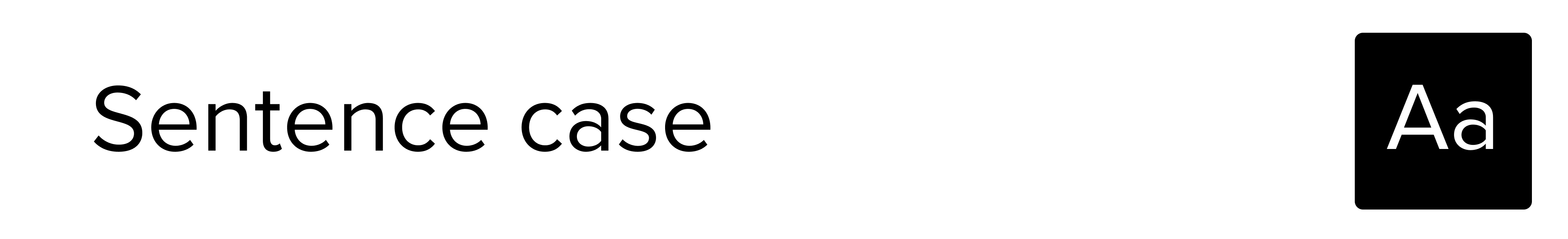
Although you can use all caps for small captions, or for visuals, we recommend using all sentence case in most typographic applications.
Think of a book outline; the size, style, and position of type not only inform what order it should be read, but also describe the parent-child relationships of the content.
One clear spaces have been developed that shift in size depending on the size of the mark. Everything starts with the logo.

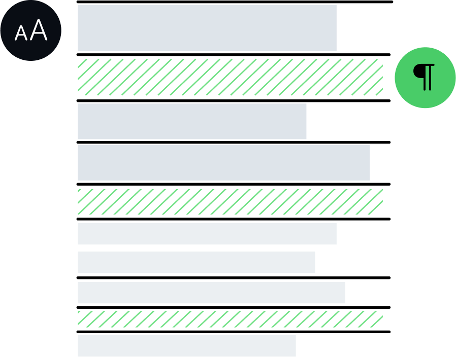
Here are some examples of typographic pairs that we commonly use on our communication.